
Cover Design Walkthrough
Creating a great cover for a book isn’t terribly hard, and with a little time and effort you can put something together that will stand out in the crowd. And what a crowd it is now. Indie authors issued more than 3.5 million unique ISBNs in 2025 alone, a nearly 40% increase over the prior year. That’s not counting KDP digital releases that don’t require an ISBN.
The first step is to think hard about the genre-signaling work you want your cover to do, and then research what’s trending in the categories you plan on marketing your title in. That doesn’t necessarily mean copying what’s out there, but it helps to have a feel for the face of the market. Breaking the mold can be an advantage, but it needs to be broken in the right way.
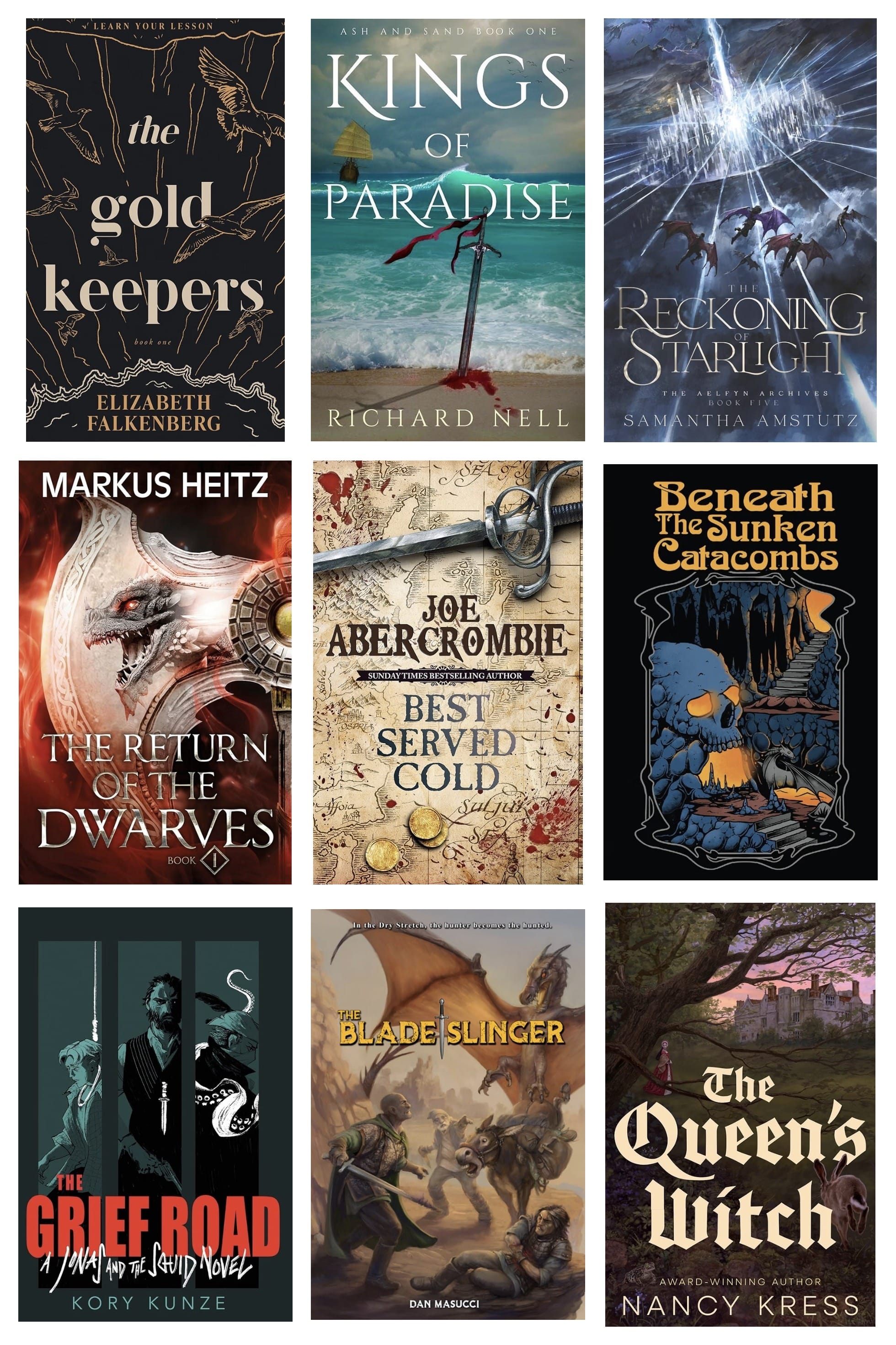
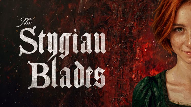
My latest novel The Stygian Blades is dark, but it’s also bawdy, and has a romance thread many books in its category lack. I wanted something that would fit the genre while signaling it wasn’t grimdark. The cover needed to capture the grit while highlighting the protagonist’s attitude.
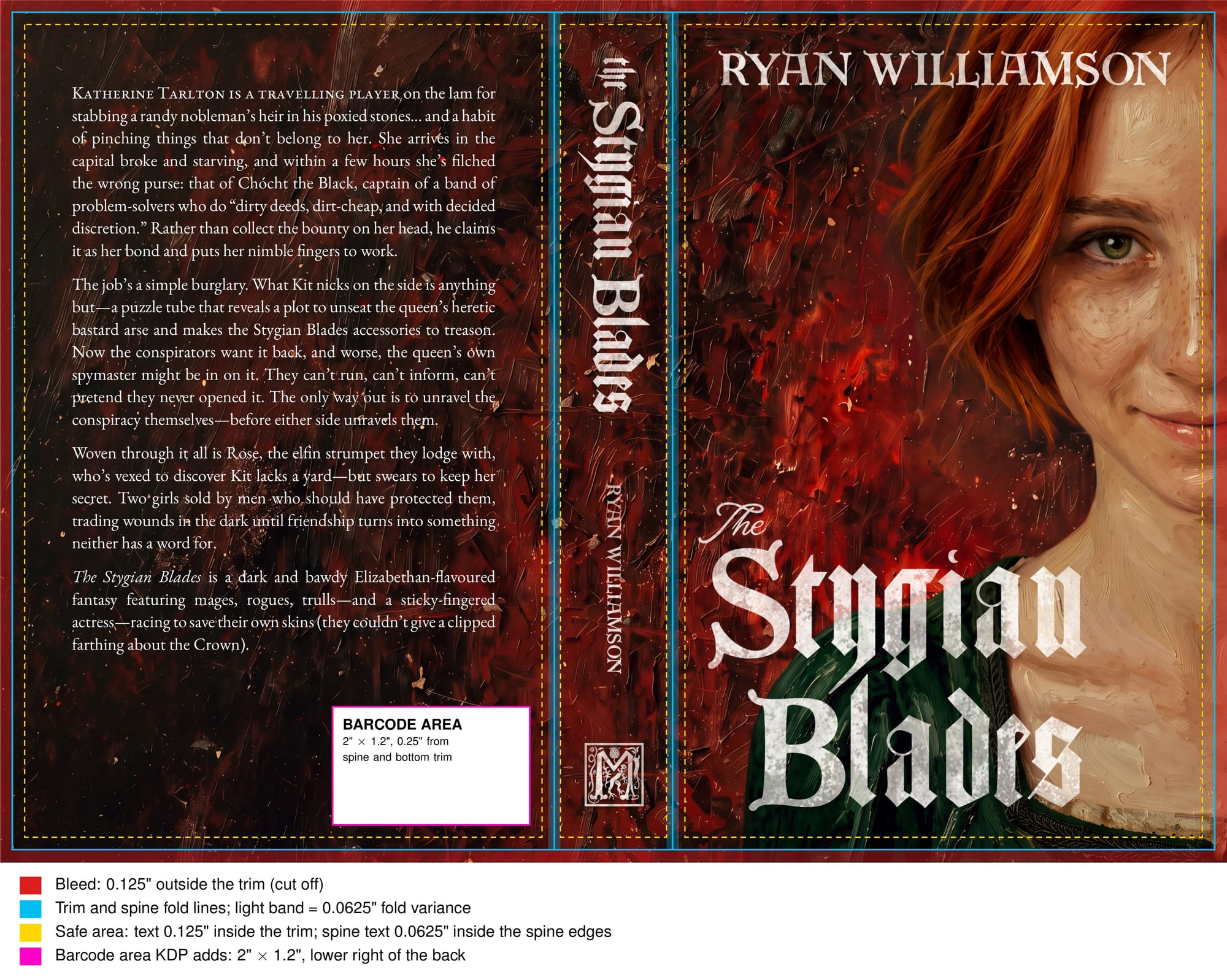
I always start with the typography. A strong category signal is blackletter type, so I designed a title treatment in a suitable font, with a cursive treatment of “The” to signal this book isn’t gothic and has some attitude.
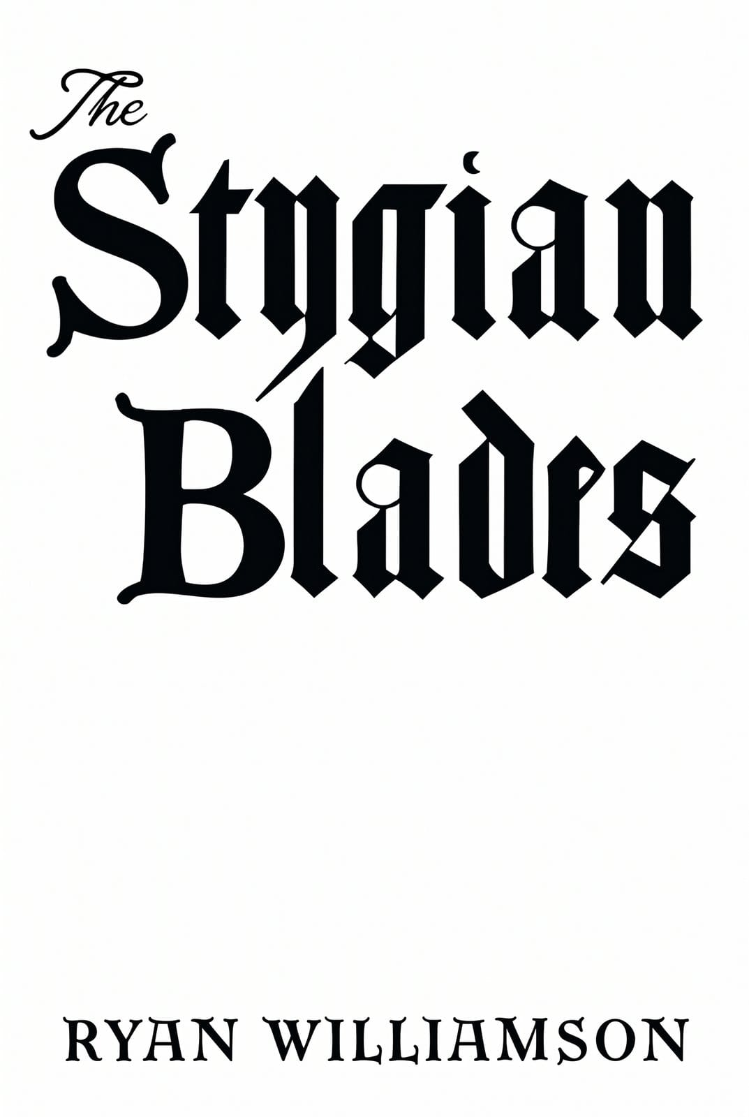
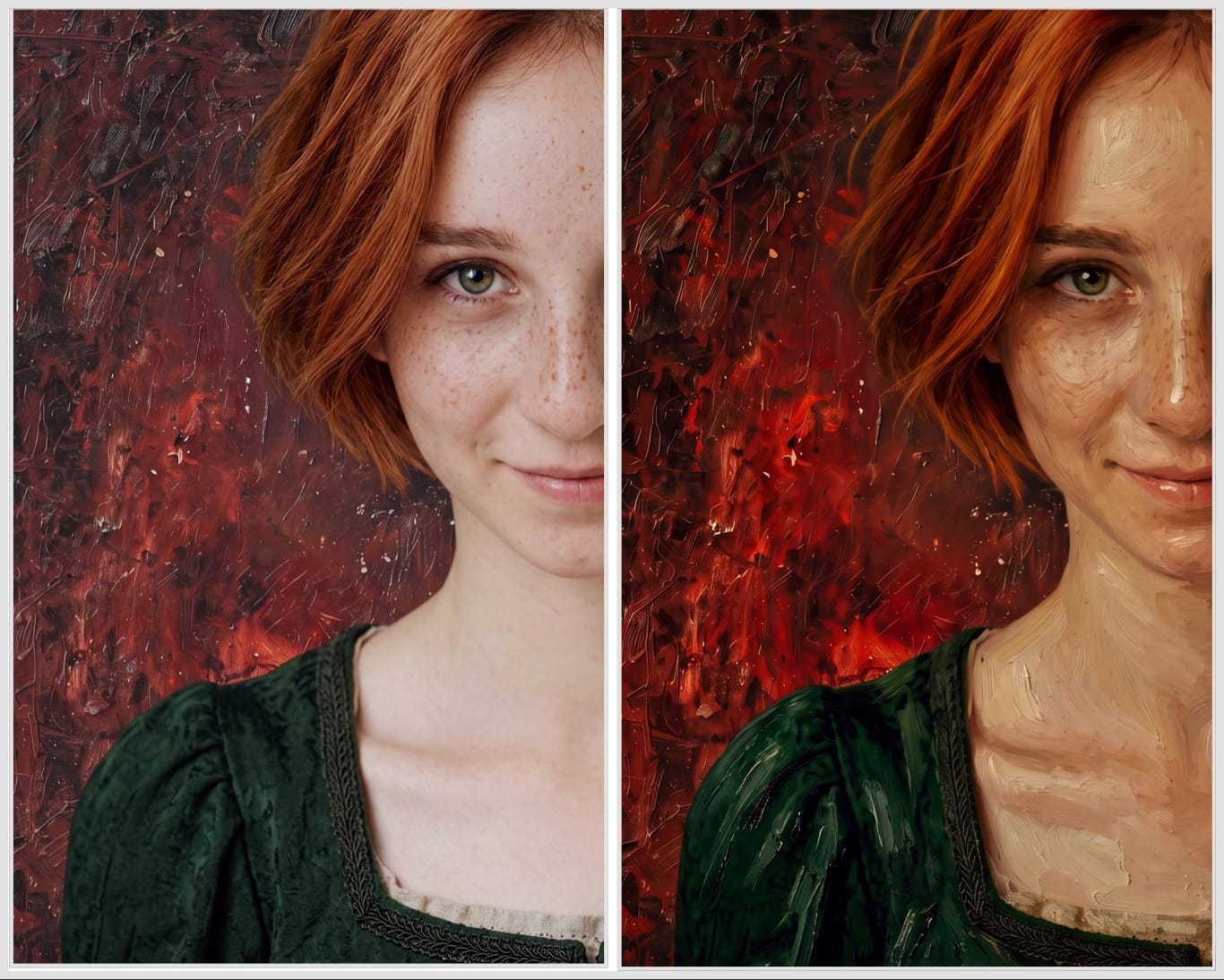
For the cover art, I started with a model I found on a stock photography site who was a dead ringer for my protagonist. Then I got to work in Photoshop, compositing period-appropriate dress and a darker background matching the color palette I’d selected for the cover.
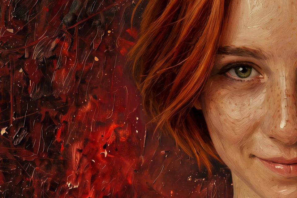
Next I took a textured background I’d created and composited the model onto it while adjusting the color and lighting curves to remove the studio photography look, then spent some time adding brushstrokes to give it an oil painting look and feel.
From there it was a simple matter of laying out the title, byline, spine and back cover elements within the publishing template guides.
Where it fits the comp set
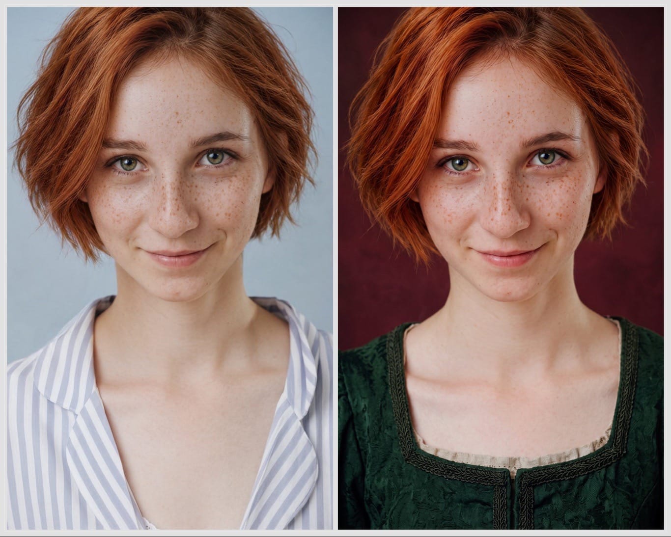
The blackletter title is the strongest link. The Queen’s Witch uses nearly the same move: cream blackletter over a painted scene, which signals early-modern England before you read a word. The Stygian Blades’ distressed white blackletter does that too, and the weathering on the letterforms matches the grit of the Best Served Cold parchment and blood spatter.
The palette fits the darker half of the grid. Red runs through Best Served Cold, Kings of Paradise (blood in the surf), and The Return of the Dwarves. The Stygian Blades’ red ground does the same work as a painterly field of strokes and flecks, so it reads as blood, fire, or both depending on the viewer, without a literal splatter.
The painted finish also matches. The Blade Slinger and The Queen’s Witch are traditionally painted, and the visible impasto on mine keeps it in that illustrated-fantasy register instead of the stock-photo look. The author name in caps across the top follows the Heitz and Abercrombie layout.
Where it breaks the mold
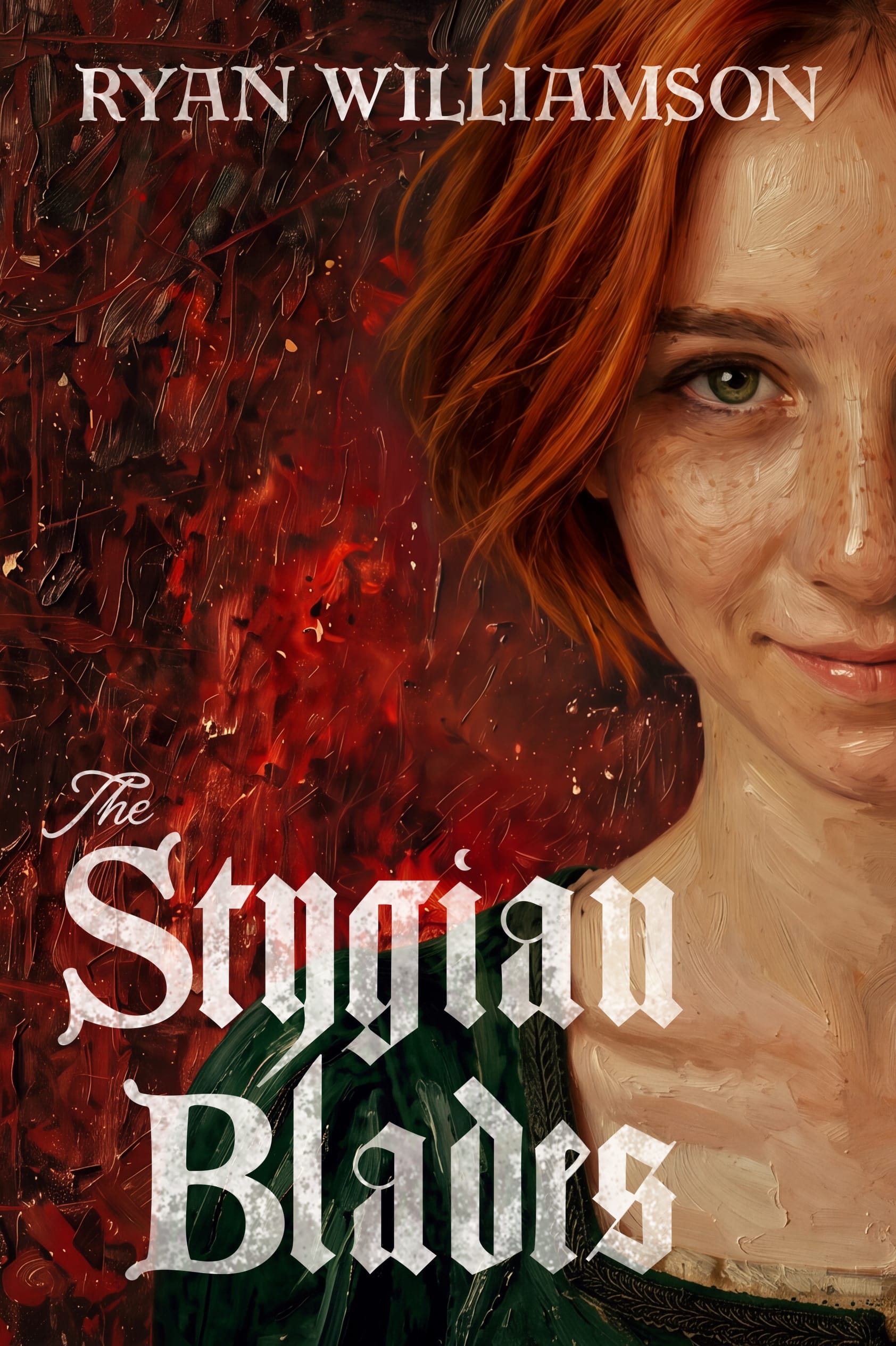
The biggest break is the face. None of the nine fills the frame with a person. Five have no figure at all. The Queen’s Witch puts a tiny woman in red far back in the scene. The Blade Slinger shows full figures in an action tableau. The Grief Road has a face, but stylized, split across panels, and grim. The Stygian Blades is a tight half-face crop with direct eye contact, sitting right in the reader’s sightline.
The second break is the missing weapon. The title says Blades, and the comp set is full of steel: the sword in the sand, the rapier, the dagger on The Grief Road, the axe-and-shield. The Stygian Blades’ cover shows no blade. My intent is that the woman herself becomes the blade the title promises, and the closed-mouth smile and steady green eye sell that.
The third is the expression. Grim is the default in this set: snarling dragon, scowling swordsman, skull. A sly, knowing smile is a different emotional hook, and in a grid of menace it’s the one that looks like it knows something.
At Amazon thumbnail size, most of the comps compress to a color field plus a title block. A single large face with one visible eye stays recognizable when shrunk, and the blackletter is big enough to read. My hope is that’s where the strategy will pay off most: in a scrolling grid like this one, The Stygian Blades is the only cover looking back at you.
The Stygian Blades is a dark and bawdy Elizabethan-flavoured fantasy for fans of Scott Lynch and Christopher Buehlman, featuring mages, rogues, trulls—and a sticky-fingered actress—racing to save their own skins (they couldn’t give a clipped farthing about the Crown).


Member discussion